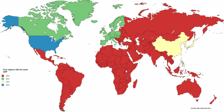
The map above shows the world divided into 4 regions each with the same GDP. Currently, World GDP is roughly $75 trillion at nominal exchange rates.
So, 25% of $75 trillion equals $18.75 trillion, which is roughly the GDP of each area above. They are:
- US: The world’s largest (IMF, World Bank) or second largest (after EU according to the UN) economy in the world and still responsible for just under 25% of the world’s economic output.
- Western Europe + Canada: While the map creator decided not to make this region coterminous with the EU, they very well could have as the EU is almost as large the US economy by most measures or bigger according to the UN.
- China, Japan, North & South Korea + Philippines: – While China’s economic growth gets all the headlines, its economy at nominal exchange rates is still only 60% of the United States. The group also includes Japan the world’s 3rd largest economy, South Korea the world’s 11th largest economy, the Philippines the 36th largest economy, and North Korea the 113th largest economy (thanks for helping!). However, if PPP dollars (a measure of how much you can buy with your dollars) were used, this group would be well over 25% as China alone becomes the biggest economy, followed by the EU and then the United State.
- Rest of World: – Finally, you have the rest of the World including Russia, India, Brazil, Australia, Africa, Latin America, the Middle East, Eastern Europe and South East Asia.
Find this map surprising? Then please share that suspire with a friend:
Eddie says
“suspire” = “sigh”; is that what the cartographer really means?
Peter says
Very different picture when you use real GDP statistics however!